
Last week I started making win probability plot after each KU basketball game, but they were always made after the game rather than in real time. Now that they are going live, I thought it would helpful to document how these are made using R and the ggplot2 package.
Calculating Win Probability
The win probabilities are based on Elo ratings. Elo ratings provide an estimate of team strength or ability at the current point in time. This makes it straightforward to determine the ratings of each team on the day the game was played. For more about Elo ratings and how they are calculated go here, or check out this explainer from FiveThirtyEight, which is what my Elo ratings are based off of.
For this example, we’ll use the Kansas vs. Kansas State game on January 3, 2017. After giving KU a boost for home court advantage Kansas had a pre-game Elo rating of 2,163, and Kansas State had an Elo rating of 1,761. This difference in Elo ratings translates to Kansas being favored by ~15 points.
We can likewise calculate the predicted point spread for every game in the data set (my data set includes all games between D1 opponents going back to 1980). This allows us to look at the difference between the predicted point spread, and the actual margin of victory. This prediction error is normally distributed with a mean of 0 and a standard deviation of 11.36. So the distribution of possible margins of victory for the Kansas vs. Kansas State game should look like this:
library(ggplot2)
library(dplyr)

data_frame(
  x = seq(-50, 50, 0.5),
  y = dnorm(seq(-50, 50, 0.5), mean = -15, sd = 11.36)
) %>%
  mutate(winner = ifelse(x <= 0, "Kansas", "Kansas State")) %>%
  ggplot() +
  geom_ribbon(aes(x = x, ymin = 0, ymax = y, fill = winner)) +
  labs(x = "away team's margin of victory")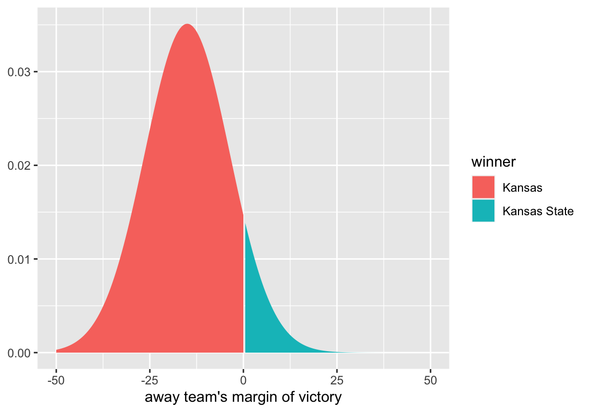
The distribution peaks at -15, which is what we calculated as the most likely outcome. By convention, point spreads are given in terms of the home team, and a negative point spread means that team is the favorite. Because this game was played at Kansas, the point spread is Kansas -15. If the game were being played at Kansas State, the point spread would be written as Kansas State +15. Therefore a negative margin of victory indicates a win for the home team. In this example, a negative margin of victory is associated with Kansas winning, and a positive margin of victory is associated with Kansas State winning. To get the probability of Kansas winning, we can simply look at the proportion of the curve that is less than zero.
pnorm(0, mean = -15, sd = 11.36, lower.tail = TRUE)
#> [1] 0.906653
So at the beginning of the game, we estimate Kansas to have a 90.7% chance of winning. As the game progresses, we calculate the win probability in the exact same way, but we also have to adjust for the current score and the amount of time remaining1. The mean of the distribution gets defined so that as the game progresses, the point spread gets less weight, and the current margin get more weight.
\[ \begin{equation} \mu = \left(point\_spread\ \times\ \frac{minutes\_remain}{40}\right) + \left(margin \times \frac{minutes\_played}{40}\right) \end{equation} \]
Similarly, the standard deviation is adjusted so that the distribution gets more narrow as the game progresses.
\[ \begin{equation} \sigma = \frac{11.36}{\sqrt{\frac{40}{minutes\_remain}}} \end{equation} \]
As the time remaining approaches 0, the denominator increases, making the standard deviation smaller and smaller.
Now we only we need the score at each moment of the game in order to calculate the mean and standard deviation. To get this information, we can scrape play-by-play data from the web.
Scraping Play-By-Play Data
There are many places we could scrape play-by-play information from, and many different packages we could use, but I’ll use the rvest package to scrape play-by-play data from ESPN. With rvest, getting the data from ESPN is fairly straightforward.
library(rvest)

game_data <- read_html("http://www.espn.com/mens-college-basketball/playbyplay?gameId=400916199")
tables <- html_nodes(game_data, css = "table")
tables <- html_table(tables, fill = TRUE)
The data we want is in tables 2 and 3, so we can select those and do some formatting.
half_1 <- tables[[2]]
colnames(half_1) <- make.names(colnames(half_1))
half_1 <- half_1 %>%
  mutate(
    minute = gsub(":.*", "", time) %>% as.numeric(),
    second = gsub(".*:", "", time) %>% as.numeric(),
    min_played = (20 - (minute + (second / 60))),
    min_remain = 40 - min_played,
    SCORE = gsub(" ", "", SCORE),
    away_score = gsub("-.*", "", SCORE) %>% as.numeric(),
    home_score = gsub(".*-", "", SCORE) %>% as.numeric(),
    period = "H1"
  ) %>%
  select(period, minute, second, min_played, min_remain, away_score,
    home_score, play = PLAY)

half_2 <- tables[[3]]
colnames(half_2) <- make.names(colnames(half_2))
half_2 <- half_2 %>%
  mutate(
    minute = gsub(":.*", "", time) %>% as.numeric(),
    second = gsub(".*:", "", time) %>% as.numeric(),
    min_played = 20 + (20 - (minute + (second / 60))),
    min_remain = 40 - min_played,
    SCORE = gsub(" ", "", SCORE),
    away_score = gsub("-.*", "", SCORE) %>% as.numeric(),
    home_score = gsub(".*-", "", SCORE) %>% as.numeric(),
    period = "H2"
  ) %>%
  select(period, minute, second, min_played, min_remain, away_score,
    home_score, play = PLAY)

full_pbp <- bind_rows(list(half_1, half_2))
full_pbp
#> # A tibble: 336 × 8
#> period minute second min_played min_remain away_score home_score play
#> <chr> <dbl> <dbl> <dbl> <dbl> <dbl> <dbl> <chr>
#> 1 H1 20 0 0 40 0 0 Jump Ball w…
#> 2 H1 19 50 0.167 39.8 0 0 Devonte' Gr…
#> 3 H1 19 50 0.167 39.8 0 0 Landen Luca…
#> 4 H1 19 43 0.283 39.7 0 2 Josh Jackso…
#> 5 H1 19 27 0.550 39.4 0 2 Kamau Stoke…
#> 6 H1 19 27 0.550 39.4 0 2 Frank Mason…
#> 7 H1 19 12 0.800 39.2 0 2 Devonte' Gr…
#> 8 H1 19 12 0.800 39.2 0 2 Dean Wade D…
#> 9 H1 18 48 1.2 38.8 2 2 Wesley Iwun…
#> 10 H1 18 33 1.45 38.6 2 2 Devonte' Gr…
#> # … with 326 more rowsNow we can create a data frame of all possible time points in the game, and fill in the scores.
library(tidyr)

minute <- 0:40
second <- 0:59
full_game <- crossing(minute, second) %>%
  arrange(desc(minute), desc(second)) %>%
  mutate(min_remain = minute + (second / 60), min_played = 40 - min_remain,
    home = 0, away = 0) %>%
  filter(min_remain <= 40)

for (i in seq_len(nrow(full_pbp))) {
  cur_time <- round(full_pbp$min_remain[i], digits = 2)
  cur_row <- which(round(full_game$min_remain, digits = 2) == cur_time)
  full_game$home[cur_row:nrow(full_game)] <- full_pbp$home_score[i]
  full_game$away[cur_row:nrow(full_game)] <- full_pbp$away_score[i]
}
Now that we have the data we want in a workable form, we can move on to calculating the win probabilities and creating the plot.
Plotting the Win Probabilities
The first thing we have to do is calculate the mean and standard deviation of the distribution at every second of the game, and the corresponding win probability.
full_game <- full_game %>%
  mutate(
    away_margin = away - home,
    mean = (-15 * (min_remain / 40)) + (away_margin * (min_played / 40)),
    sd = 11.36 / sqrt(40 / min_remain),
    home_winprob = pnorm(0, mean = mean, sd = sd, lower.tail = TRUE),
    away_winprob = 1 - home_winprob
  )
full_game
#> # A tibble: 2,401 x 11
#>    minute second min_remain min_played  home  away away_margin  mean    sd
#>     <int>  <int>      <dbl>      <dbl> <dbl> <dbl>       <dbl> <dbl> <dbl>
#>  1     40      0       40       0          0     0           0 -15    11.4
#>  2     39     59       40.0     0.0167     0     0           0 -15.0  11.4
#>  3     39     58       40.0     0.0333     0     0           0 -15.0  11.4
#>  4     39     57       40.0     0.0500     0     0           0 -15.0  11.4
#>  5     39     56       39.9     0.0667     0     0           0 -15.0  11.4
#>  6     39     55       39.9     0.0833     0     0           0 -15.0  11.3
#>  7     39     54       39.9     0.1        0     0           0 -15.0  11.3
#>  8     39     53       39.9     0.117      0     0           0 -15.0  11.3
#>  9     39     52       39.9     0.133      0     0           0 -15.0  11.3
#> 10     39     51       39.8     0.150      0     0           0 -14.9  11.3
#> # … with 2,391 more rows, and 2 more variables: home_winprob <dbl>,
#> #   away_winprob <dbl>
We can then put the data into long format using the gather function from the tidyr package, and plot the probabilities!
full_game %>%
  gather(team, winprob, home_winprob:away_winprob) %>%
  ggplot(aes(x = min_played, y = winprob, color = team)) +
  geom_line()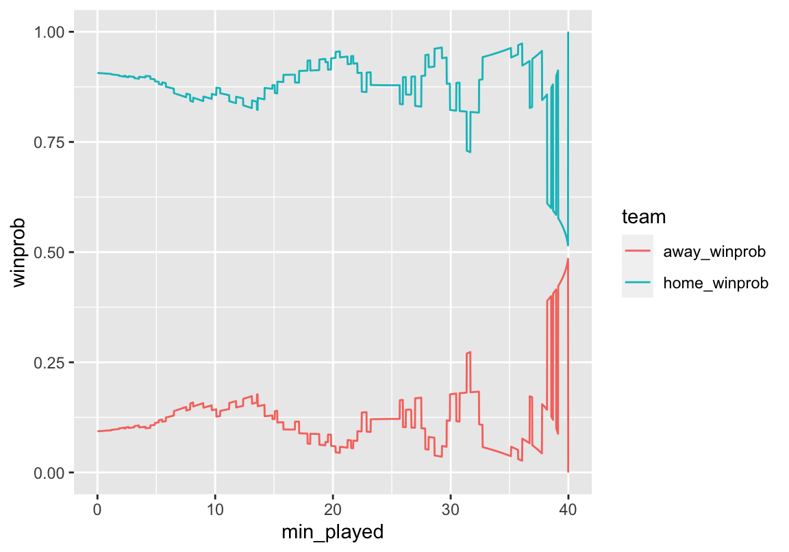
Looks pretty good! We can see that even though Kansas wasn’t leading on the score board the whole game, they were always favored to win. Although Kansas State was able to make it close at the end of the game. Now we can add some formatting to make it look prettier.
full_game %>%
  gather(team, winprob, home_winprob:away_winprob) %>%
  ggplot(aes(x = min_played, y = winprob, color = team)) +
  geom_line(size = 1) +
  scale_color_manual(values = c("#512888", "#0051BA"),
    labels = c("Kansas State", "Kansas")) +
  geom_hline(aes(yintercept = 0.5), color = "#000000", linetype = "dashed",
    size = 1) +
  scale_y_continuous(limits = c(0, 1), breaks = seq(0, 1, by = 0.1),
    labels = paste0(seq(0, 100, by = 10), "%")) +
  scale_x_continuous(limits = c(0, 40), breaks = seq(0, 40, 4),
    labels = paste0(seq(40, 0, -4))) +
  labs(y = "Win Probability", x = "Minutes Remaining") +
  theme_minimal() +
  theme(legend.position = "bottom", legend.title = element_blank())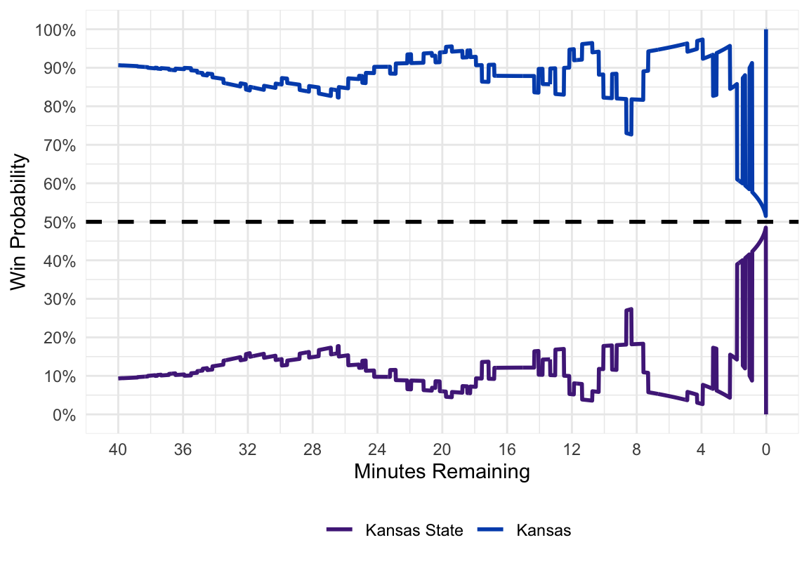
And there you have our final product! For future Kansas games, I will be tweeting out real time win probability graphs.
Bonus: Animate the Plots
We could go one step further and animate the win probability plot using David Robinson’s gganimate package. Our code looks the same, except we add a frame aesthetic and the gg_animate function at the end.
library(gganimate)

p <- full_game %>%
  filter(second %% 20 == 0) %>%
  gather(team, winprob, home_winprob:away_winprob) %>%
  ggplot(aes(x = min_played, y = winprob, color = team, frame = min_played)) +
  geom_line(aes(cumulative = TRUE), size = 1) +
  scale_color_manual(values = c("#512888", "#0051BA"),
    labels = c("Kansas State", "Kansas")) +
  geom_hline(aes(yintercept = 0.5), color = "#000000", linetype = "dashed",
    size = 1) +
  scale_y_continuous(limits = c(0, 1), breaks = seq(0, 1, by = 0.1),
    labels = paste0(seq(0, 100, by = 10), "%")) +
  scale_x_continuous(limits = c(0, 40), breaks = seq(0, 40, 4),
    labels = paste0(seq(40, 0, -4))) +
  labs(y = "Win Probability", x = "Minutes Remaining") +
  theme_minimal() +
  theme(legend.position = "bottom", legend.title = element_blank())

gganimate(p, interval = 0.2, title_frame = FALSE)
We could also animate the distribution to show exactly how the distribution is changing as we alter the mean and standard deviation.
library(purrr)

dist <- full_game %>%
  filter(second %% 20 == 0) %>%
  select(min_played, mean, sd) %>%
  as.list() %>%
  pmap_df(.l = ., .f = function(min_played, mean, sd) {
    data_frame(
      min_played = min_played,
      x = seq(-50, 50, 0.5),
      y = dnorm(seq(-50, 50, 0.5), mean = mean, sd = sd)
    ) %>%
      mutate(winner = ifelse(x <= 0, "home_win", "away_win"))
  }) %>%
  mutate(min_played = round(min_played, digits = 2))

d <- ggplot(dist, aes(frame = min_played)) +
  geom_ribbon(aes(x = x, ymin = 0, ymax = y, fill = winner)) +
  scale_fill_manual(values = c("#512888", "#0051BA"),
    labels = c("Kansas State", "Kansas")) +
  scale_x_continuous(breaks = seq(-50, 50, 10)) +
  labs(x = "Kansas State Margin of Victory", title = "Minutes Played: ") +
  theme_minimal() +
  theme(legend.position = "bottom", legend.title = element_blank())

gganimate(d, interval = 0.2)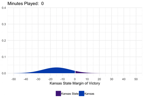
Limitations
There are several limitations to the way these win probabilities are calculated. First, the calculations assume that each team has a 50% chance of winning if the game goes into overtime. This isn’t entirely accurate, as a team favored before the game would still be favored in overtime (but not by as much). Secondly, I don’t factor in who has possession of the ball. For example, if a team is down by 1 with 25 seconds to go and the ball, the model probably underestimates their chance of winning. In reality, when calculating the mean of the distribution, expected points on the current possession should be factored into the current margin. However, this model provides a nice starting place, and I think provides a pretty good general idea of how a team’s probability of winning changed throughout the game.
Acknowledgments
Featured photo by Barna Bartis on Unsplash.
Footnotes
For details on the where these formulas come from, see Wayne Winston’s book, Mathletics, and Neil Paine’s explainer.↩︎