
After more than a year and a half, the 2016 presidential election is finally over, with Donald Trump projected to win. This is in contrast to many of the election forecasts, which almost unanimously predicted a victory for Hillary Clinton. Now that the results are in, we can finally answer the question of who did the best (or least worst?) job of forecasting the election.
There are several ways we could look at this question, but for the purpose of this analysis we’ll focus on two. The first is prediciton accuracy: how close were a model’s probabilities of winning each state to what actually happened? The second is model accuracy: if we assume that the model estimated probabilities were correct, how likely is it that we would see the outcome that was observed?
Now, let’s see how some different forecasts performed.
The Forecasts
For this analysis I’m going to focus on some of the more popular forecasts from this election cycle: the New York Times, FiveThirtyEight, Huffington Post, PredictWise, the Princeton Election Consortium, Poll Savvy, Daily Kos, Crosstab, and Slate (Pierre-Antoine Kremp). Additionally, I’ll include the 2012 electoral map as a baseline. A special thanks to Danny Page who compiled all of the data, and whose analysis on the different forecasts can be found here. As always, the code and data for this post can be found on my github.
Prediction Accuracy
For the first part of the analysis, we’ll look at how close the predictions were in each state for each model. To do this, we’ll use the Brier Score, which is a measure of how close predicted probabilities were to an observed event. The formula for the Brier Score is given as
\[ BS = \frac{1}{N} \displaystyle\sum_{t=1}^{N}(f_t-o_t)^2 \]
where “N” is the total number of predictions, “f” is the predicted probability of the event, and “o” is the observed outcome. Thus, a perfect prediction (e.g., a probability of 1.0 and the event actually occuring, or a probability of 0.0 and the event not occuring) would result in a Brier Score of 0, and the worst possible score is 1. For example if a model predicted Hillary Clinton had an 87 percent chance of winning a state, and she ended up winning that state, that part of the Brier score would be calculated as (0.87 - 1)^2 = 0.0169. Because the probability is close to 1, and the event happened, the Brier Score is low, indicating high prediction accuracy. In contrast, if Clinton were to lose that state, the Brier score would be (0.87 - 0)^2 = 0.7569, a relatively large number indicating a bad prediction. For any given model then, we can add up these prediction errors for each state, and then divide by the total number of predictions to get an overall Brier Score for each model:
| Forecast | Brier Score |
|---|---|
| FiveThirtyEight | 0.066 |
| Crosstab | 0.070 |
| Slate | 0.076 |
| PredictWise | 0.076 |
| New York Times | 0.076 |
| Princeton | 0.077 |
| Poll Savvy | 0.080 |
| Daily Kos | 0.080 |
| Huffington Post | 0.090 |
| 2012 Map | 0.125 |
Using this method, all models out perform the 2012 map, as we would expect. Nate Silver and FiveThirtyEight come out on top, with the lowest average prediction error. However, we can also look at a weighted Brier Score. Maybe we care more about an error if there were a large number of electoral votes were at stake. For example, predicting Florida incorrectly has more implications for who wins the presidency than predicting North Dakota incorrectly. We can add a weight to the Brier Score formula by multiplying the electoral votes by the error.
\[ BS = \displaystyle\sum_{t=1}^{N}EV_t(f_t-o_t)^2 \]
For this method, we are just summing all of the weighted prediction errors, rather than taking the average. This means that the Brier score is equivalent to the number of electoral votes that were incorrectly predicted. Thus, a perfect score is still 0, but the worst possible score is 538, if every state were incorrectly predicted with a probability of 0 or 1.
Using the weighted Brier Score, we see similar results.
| Forecast | Brier Score | Weighted Brier |
|---|---|---|
| FiveThirtyEight | 0.066 | 48.793 |
| Crosstab | 0.070 | 59.601 |
| Princeton | 0.077 | 62.813 |
| New York Times | 0.076 | 64.643 |
| Poll Savvy | 0.080 | 64.668 |
| Slate | 0.076 | 65.038 |
| PredictWise | 0.076 | 68.132 |
| Daily Kos | 0.080 | 69.283 |
| Huffington Post | 0.090 | 80.722 |
| 2012 Map | 0.125 | 100.000 |
FiveThirtyEight again performs the best, prediting the equivalent of about 49 electoral votes incorrectly, a full 11 electoral votes better than the second best performing model (Crosstab). Compare this to the 2012 map, which would have predicted 100 electoral votes incorrectly. So using either the raw or weighted Brier Score, all models performed better than our baseline of the 2012 map, and FiveThirtyEight performed better than all other models.
Model Accuracy
To get an idea of the model accuracy, we can simulate the election thousands of times for each model, assuming that their estimated probabilities are the true probabilities in each case. For each simulation we will then get a distribution of the number of states each model should expect to predict incorrectly. We will then compare this expected number of incorrect picks to the observed number. A large discrepancy between the expected and observed number of incorrect predictions means that the model’s probabilites were not consistent with the observed data, indicating poor model accuracy.
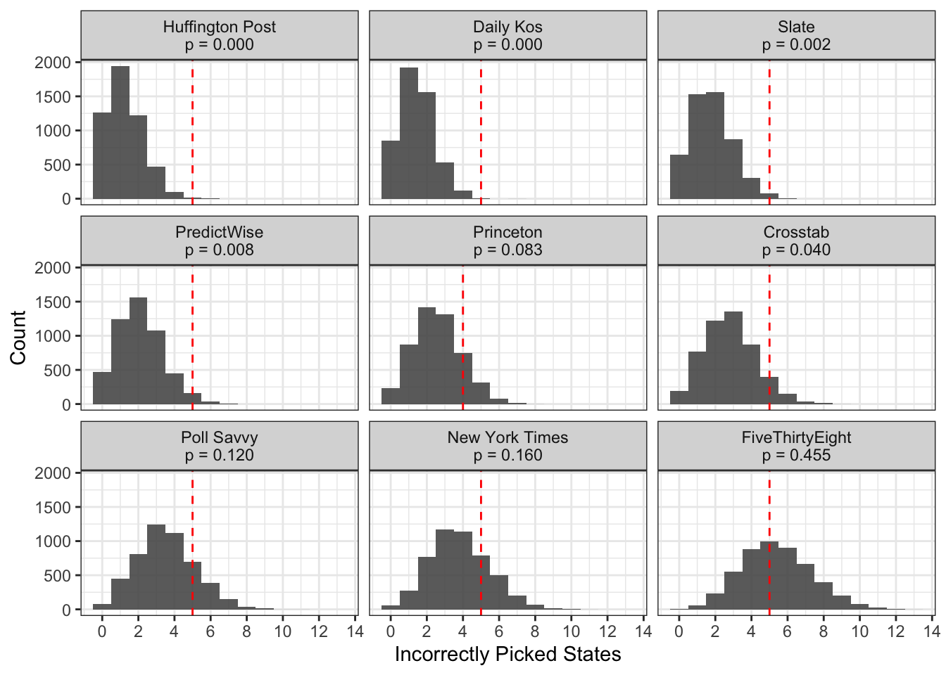
In the plot above, the red line indicates the number of states the model actually predicted incorrectly. All of the models incorrectly predicted 5 states, with the exception of Princeton, which incorrectly predicted only 4 states. However, we see that we would expect most of the models to get less states incorrect than that, given their estimated probabilities. For example, we would expect Huffington Post to miss 1.25 states on average, and FiveThirtyEight to miss 5.37 states on average, given their probabilities in each state. So the Huffington Post’s model was not as accurate as FiveThirtyEight’s.
This occurs because Huffington Post had less uncertainty in their model, so there were fewer states that their model thought had a chance to flip, and thus result in an incorrect prediction. FiveThirtyEight had more uncertainty, meaning that on average, their model would expect to get more states wrong, because there was less certainty in who would win each state. As it turns out, this election was a lot more uncertain than people thought, which is why FiveThirtyEight’s expected value is closer to what was observed than other models that had less uncertainty.
We can quantify how wrong a model was by looking at the proportion of simualtions that resulted in more incorrect picks than what was observed (the p-value). This can be thought of as the probability of incorrectly picking the observed number, if your probabilities were correct. Traditionally, p-values less than 0.05 are used to indicate poor model fit. In the graphic, we can see that only FiveThirtyEight, the New York Times, Poll Savvy, and Princeton have p-values over 0.05. This means that we would conclude that the probabilities provided by these models are plausible, given the data we observed, whereas the other probabilities provided by the other models would be rejected.
There is one problem with this simulation that we could address to make our results more accurate. The simulation assumes that the results in each state are indepdent of each other. However, we know this is inaccurate, as many states tend to vote in the same way as other states with similar demographic characteristics. Practically, this means that the distributions in the above graphic aren’t as variable as they should be. The expected value won’t change much, but the distribution of plausible numbers of incorrect picks should get wider. Let’s test that and see if our conclusions are the same.
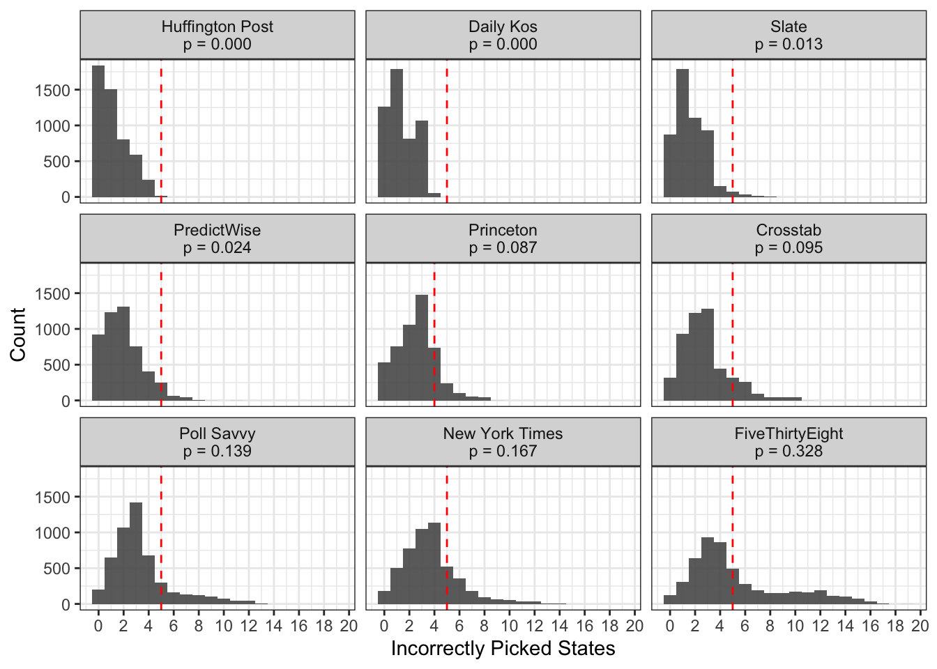
As expected, the distributions are much wider once we allow for correlated prediction errors, especially for the models that have more uncertainty in their predictions. Using the correlated errors, Princeton, Crosstab, Poll Savvy, the New York Times, and FiveThirtyEight all have p-values greater than 0.05, indicating that their estimated probabilities fit our observed data.
Conclusion
Nate Silver and FiveThirtyEight received a lot of criticism for being bullish on Trump, but it looks like FiveThirtyEight gets to have the last laugh. Their model outperformed all of the other election forecasts that I analyzed: it had the best prediciton accuracy as measured by the raw and unweighted Brier Score, and it also had the best model accuracy, with simulations using their probabilities more closely matching the observed data than any other model. In an incredibly messing election, Nate Silver was the real winner.
Acknowledgments
Featured photo by Element5 Digital on Unsplash.